
Our Favorite Paint Colors for Old Houses

East Isles Victorian project
The right paint color can change everything—making a room feel brighter, cozier or more connected to its details. In old houses, we love shades that work with natural light, flatter original features and add effortless character to a room. From deep, dramatic hues to soft neutrals, here are a few of our favorites, shown in real homes we’ve worked on.
Rich Paint Colors For Old Houses
Older homes wear saturated, moody shades beautifully. Thick plaster walls, natural wood trim, and rooms with history behind them can carry color in a way new builds often can’t. Rich hues cozy up a space and feel timeless—plus, they’re a great way to play up the character that makes old homes so special.
Because older homes often have more defined rooms (no open floor plans here), you can experiment with different colors from space to space. We love this—it creates opportunities for personality and contrast. Just be sure to think through the overall palette so that, even if each room has its own tone, everything still feels cohesive as you move through the home.
Blues
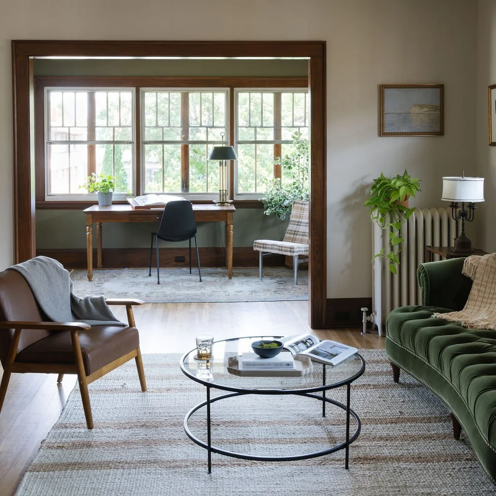
Greens

Pine Grove (BM) in our Lyndale Craftsman project
Yellows
Reds
Purples & Pinks

East Isles Victorian project
Soft Neutral Paint Colors For Old Houses
Neutrals might not sound exciting, but in old homes, they’re often the secret to letting original details take center stage. Plaster walls, intricate trim and natural wood floors all look great against shades that are soft, layered and just a touch complex.
The trickiest thing with neutrals? Light changes everything. The direction your windows face—and even the time of day—can shift how a color reads. We always test a few options before committing to make sure the tone feels just right in the space!
Cool Neutrals
They’re perfect for south-facing rooms, bright kitchens and bathrooms, or anywhere you want a light backdrop that won’t feel stark.
Warm Neutrals
These warm neutral shades bring a hint of warmth without feeling too yellow-y. They pair beautifully with original wood trim or can soften the edges of darker, more saturated accent colors.
Warm Whites
Not every “white” is created equal. These options have subtle undertones that work especially well in homes where pure white would feel too cold.
Cool Whites
We rarely recommend a true cool white, but these are a few that don’t turn too icy. They can work to balance a space that naturally has a lot of warmth through the sunlight, trim, furnishings and more.

Nokomis Modern Tudor project
Real-Life Palettes We Love
Paint colors always look different in real life, which is why we love sharing the palettes we’ve actually used in our own projects! These combos show how rich hues, soft neutrals and bold accents come together in old homes we’ve worked on.
East Isles Victorian
The paint color selections in this home were made by Yond Interiors in collaboration with the homeowner.

Bathroom
Walls/ceiling: Skimming Stone (F&B)
Vanity: Brinjal (F&B)
Beadboard/trim: Elephant’s Breath (F&B)

Kitchen
Marmorino plaster walls: Drift of Mist (SW)
Cabinets: Metropolitan (BM)
Island: Etruscan Red (F&B)
Lyndale Craftsman

Kitchen
Walls/ceiling: Collectors Item (BM)
Cabinets: Oil Cloth (BM)

Dining Room
Walls: Knoxville Gray (BM)
Ceiling: Edgecomb Gray (BM)
Living Room
Sun porch: Pine Grove (BM)
Living room walls: Edgecomb Gray (BM)
Common Paint Questions We Get
Should I paint my original wood trim?
Unless it’s already been painted, we always lean toward keeping wood trim stained. In our Lyndale craftsman remodel, for example, we repaired and refinished the original trim—and it’s gorgeous.
Warm or cool white?
It depends a lot on the light, and the same white paint will look totally different from room to room. North-facing rooms often do better with warmer whites (Alabaster, Swiss Coffee, Greek Villa) to neutralize blue undertones. Bright, south-facing rooms can handle cooler whites better (Snowbound, Wevet).
Will dark colors make my room feel smaller?
Not necessarily. Dark hues can make spaces feel sophisticated, intentional and cozy, especially with good lighting and contrasting trim.
Do the ceilings all need to be white?
Nope. We’re big fans of color-drenching (ceiling, trim and walls all one color), and it works well in many styles of homes. The ceiling can also be a place to do something with personality, like buttery yellow in an otherwise white room. If you are going with white ceilings, you don’t need to use the exact same color of white for every single ceiling in your house, either.
Do I have to stick to historic colors?
Not at all! Historic palettes—like the earthy Craftsman tones or jewel-toned Victorians you’ll see in heritage collections from paint brands—are a great reference point. (We love the Historic Color Collection from Hirshfield’s.)
But your home doesn’t have to live in the past. We think of color as a way to honor the bones of a house and bring in your personality. Sometimes that means a period-appropriate hue; sometimes it means the moody teal you can’t stop thinking about.
How do I test a paint color before committing?
Lighting and finishes change everything, so it’s worth taking the time to test. We recommend painting large swatches (at least 2x2 feet) on a sample board instead of directly on the wall. You can move it around to see how the color shifts in different light—and you’ll avoid having to sand the wall smooth later.

East Isles Victorian project
Whether it’s a dusty green, a soft off-white or the perfect unexpected accent, the right paint can make your home feel both fresh and timeless. And trust us, we have so many fun paint colors up our sleeves!
If you’re planning a bigger remodel, paint is just the start. We love helping homeowners pull everything together—colors, finishes, layouts—so the end result feels both true to your house and perfectly suited to the way you live today. Learn more about our design-build services.